Department of the Interior
Unsolicited Website Redesign
For a school project, we chose to redesign a government website. Collaboratively, we conducted initial user testing, then individually worked on the redesign and information architecture.
Problem
The Department of the Interior (DOI) lacks a user-friendly navigation system and requires a cohesive and updated brand identity.
Solution
I undertook an unsolicited redesign of the DOI website, emphasizing information architecture and UI design.
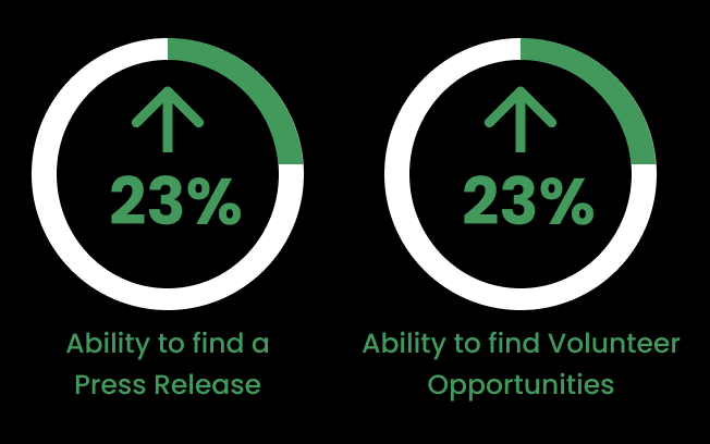
Impact
My Roles
User Research
Information Architecture
Usability Testing
Five Second Testing
Prototyping
UI Design
Team Member Roles
Initial User Testing - Collaborated with Robin Hatterschide
Tools Used
Miro
FigJam
Figma
InVision
Trello
Zoom
01 User Research
User Testing:
Users found it challenging to navigate.
The site/pages lacked organization.
The design appeared dull, although users appreciated the images.
Heuristic Evaluation:
Navigation bars lacked consistency.
There were numerous social media links.
The navigation was disorganized.
02 Definition & Ideation
Site Maps:
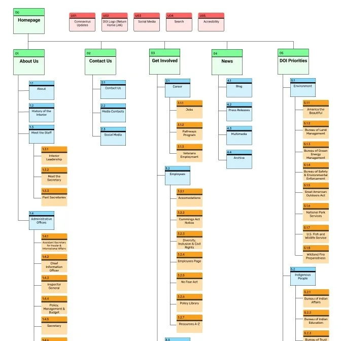
Created site maps in Figma to establish the current structure and then set the foundation for an updated navigation framework..
Card Sorting:
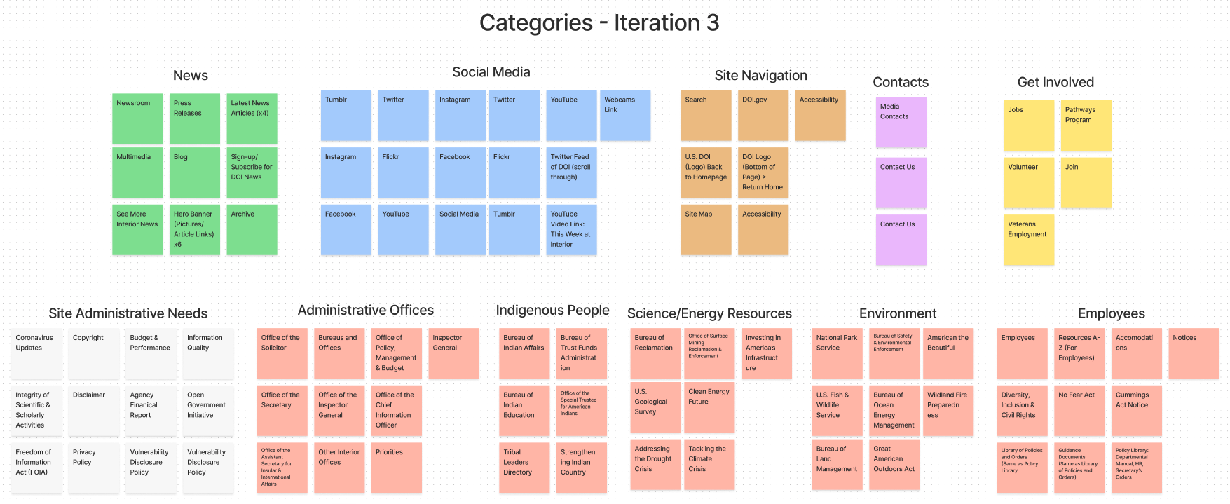
Conducted in FigJam to reorganize current pages and links for the updated navigation system.
Feature Prioritization Matrix:
Organized user insights from usability testing to identify key features.
Provided the project with a clearer purpose.
Mood Board:
Developed using InVision to integrate UI and UX concepts for the redesign.
03 Prototyping & Testing
Prototypes
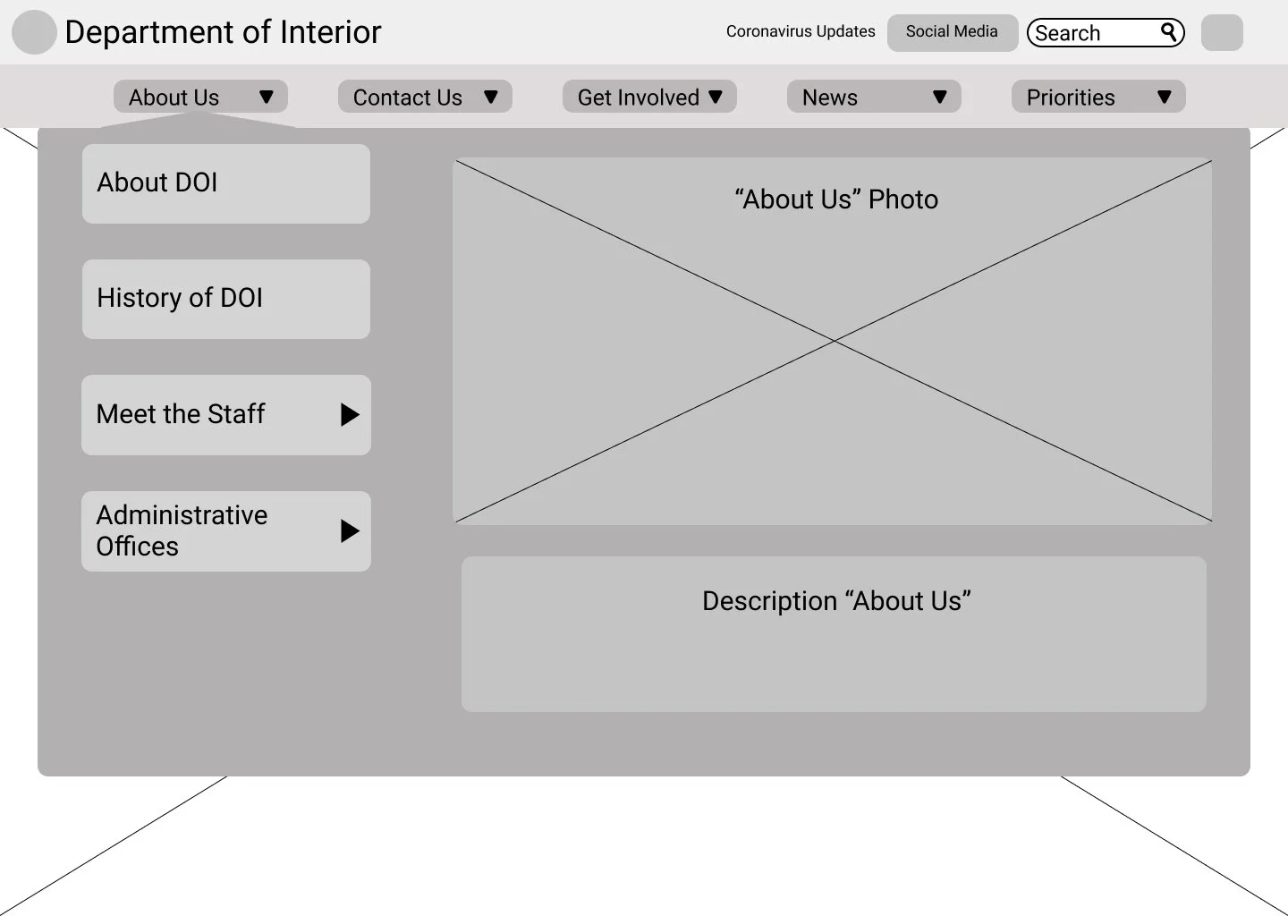
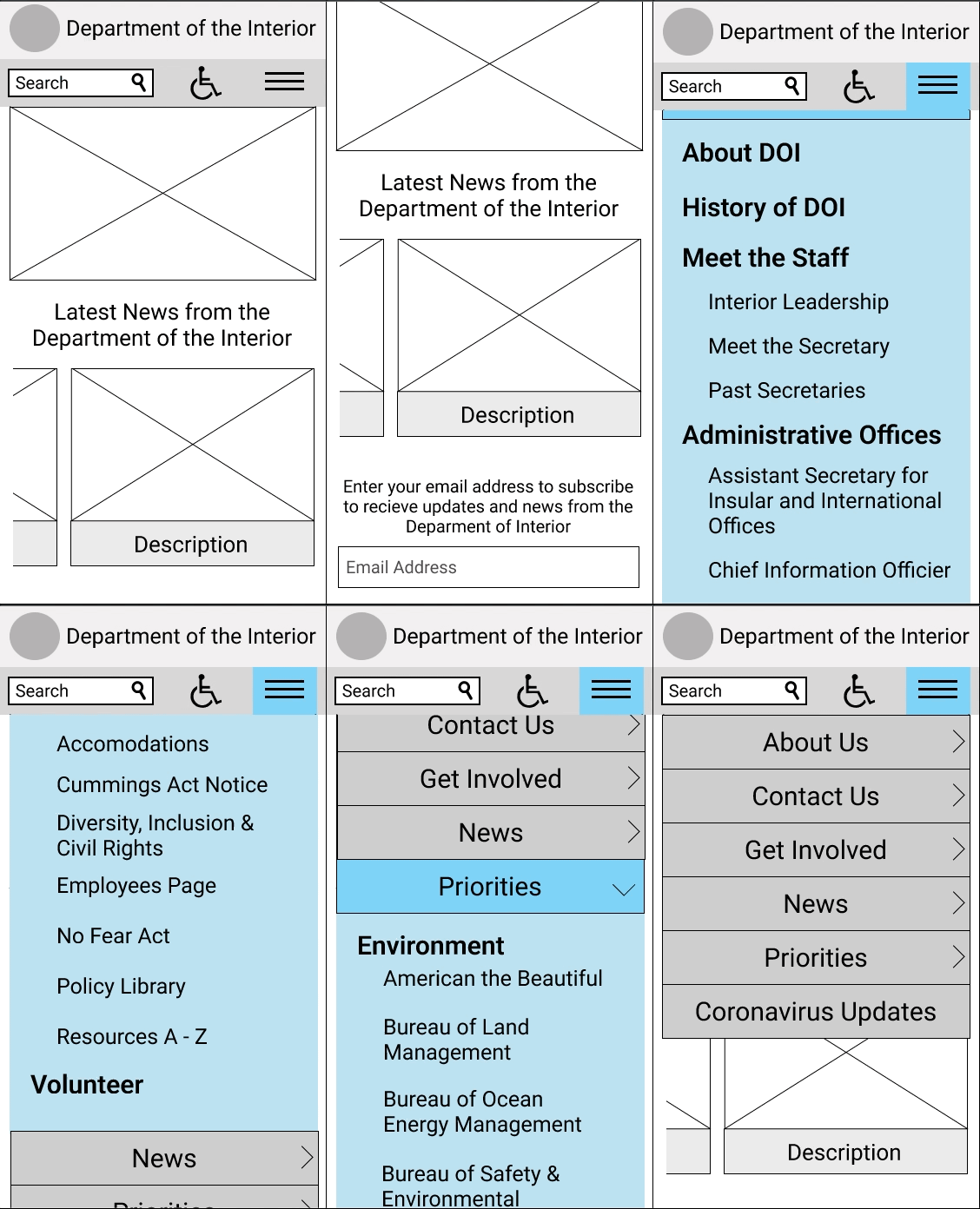
Wireframes and prototypes were designed in low, mid and high fidelity.
Usability Testing
Testing was completed at each level to unveil potential user issues
04 High Fidelity Desktop
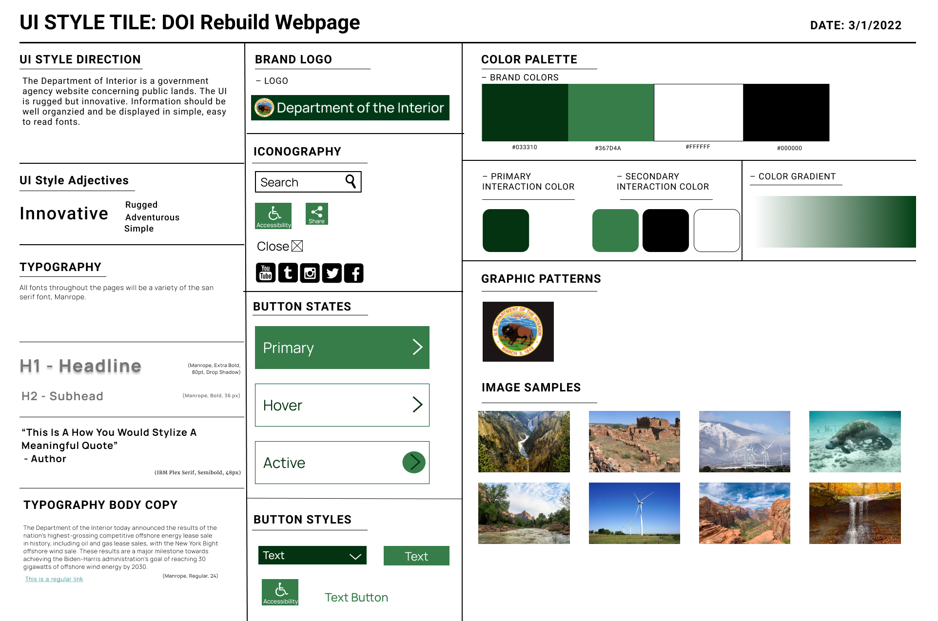
Style Guide
A new style guide was designed and integrated in the high fidelity prototypes.
Main Iterations:
The primary website updates encompassed improved information architecture, redesigned page layouts, and consistent UI patterns throughout the entire site.
05 High Fidelity Mobile
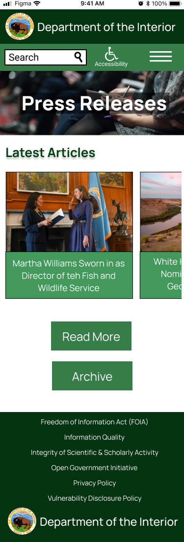
Mobile Prototype
Utilizing responsive design, the mobile version of the Department of the Interior website was created.
06 Conclusion
This being my first desktop design, I encountered a significant learning curve. The key areas where I gained the most knowledge were:
Responsive design
Information architecture
Five-second testing
Style guides
Maintaining consistent brand/theme elements
Future Ideas:
Completely rebuild the entire site.
Incorporate more of their social media content.
Improve organization of the "Newsroom" and articles.
07 Documentation
If you would like more information please feel free to contact me or check out the links!


